Photography lessons from space
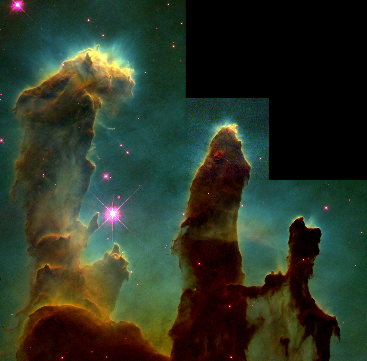
Back in 1995, NASA pointed the Hubble Space Telescope at a small section of the Eagle Nebula (M16) in the constellation Serpens 7,000 light years away. The image it produced, known as The Pillars of Creation, is probably one of the first images that spring to mind when talking about astrophotography. The public was predictable thrilled with this and other images coming from the telescope (images like the Hubble Deep Field). And thanks partly to their public-domain status, these images find their way into all kinds of usages. The Pillars of Creation, being among the most famous, can be found on almost any object, from skateboards to aprons:
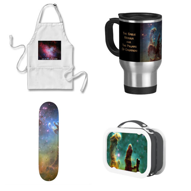
Yes, you can buy these and LOTS more here
Simply put people love this image. But, as this article points out, the famous pillars don’t exist anymore and were actually destroyed by a supernova that took place about 6,000 years ago; the light of their destruction just hasn’t made its way to Earth just yet. So what does it mean that the famous pillars in the photograph we all know were obliterated about 5,820 years before photography was even invented? And should this have any bearing on how we should think about the images we make here on Earth?
Part of what’s fascinating about images like this to me is the fact that they visibly record the incomprehensible. The first hurdle in trying to comprehend what you’re seeing in these pictures is the scale of the distance involved. I would argue that even conceptualizing the amount of empty space in our own solar system is pretty much impossible. The website If the Moon were only 1 pixel does as good a job as any at trying to parse this amount of space down into a human scale, but still. You. Just. Keep. Scrolling. The distance between Mars and Jupiter alone is incomprehensibly far when you put it in human terms like miles or kilometers. And if the scale of our own miniscule solar system isn’t mind-bending enough, think about it this way: When the Hubble revisited the Pillars of Creation earlier this year, NASA published this side-by-side comparison of the structures 20 years apart:
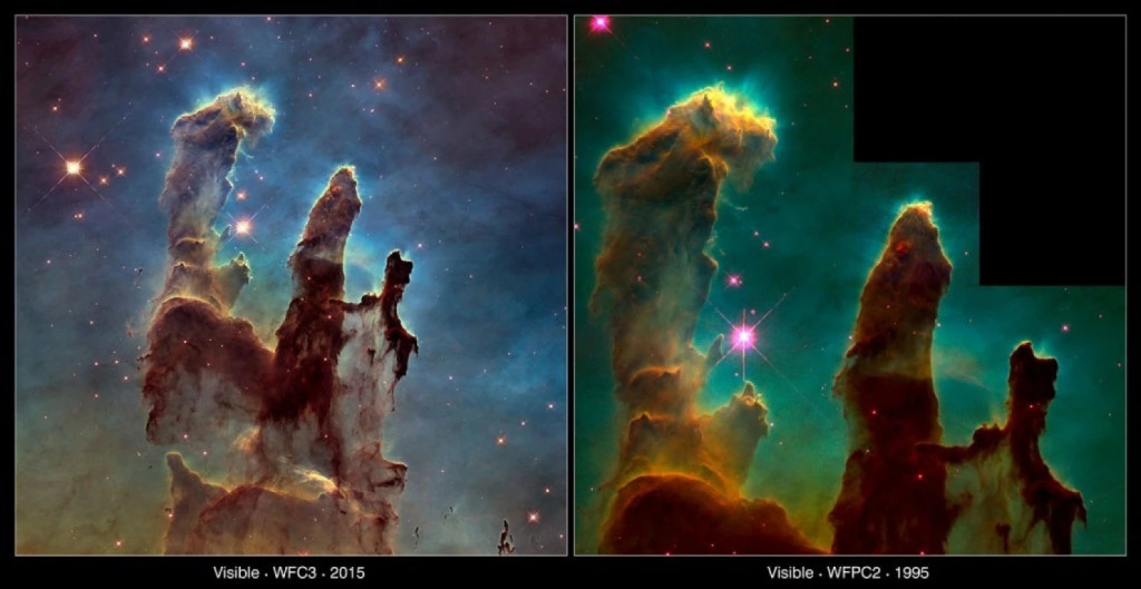
Image Credits: NASA/ESA/Hubble Heritage Team (STScI/AURA)/J. Hester, P. Scowen (Arizona State U.)
Besides the higher resolution provided by the updated camera Hubble got in May of 2009, it looks pretty similar, right? Some tiny differences maybe, but nothing drastic. Now realize that, according to this NASA report from January, parts of these clouds of gas are moving through space at about 450,000 miles per hour. For 20 years. That’s 10.8 million miles per day. Over 20 years? That’s 78,840,000,000 miles. And it looks almost exactly the same. That’s how far away we are; something can shift by billions of miles and look pretty much the same. It makes the whole notion of human scale seem a little inflated (cue Carl Sagan). What we see is impossibly abstracted from anything human. Jorge Luis Borges’ short story On Exactitude in Science comes to mind as a vehicle for thinking about of abstraction and representation of physical spaces:
… In that Empire, the Art of Cartography attained such Perfection that the map of a single Province occupied the entirety of a City, and the map of the Empire, the entirety of a Province. In time, those Unconscionable Maps no longer satisfied, and the Cartographers Guilds struck a Map of the Empire whose size was that of the Empire, and which coincided point for point with it. The following Generations, who were not so fond of the Study of Cartography as their Forebears had been, saw that that vast map was Useless, and not without some Pitilessness was it, that they delivered it up to the Inclemencies of Sun and Winters. In the Deserts of the West, still today, there are Tattered Ruins of that Map, inhabited by Animals and Beggars; in all the Land there is no other Relic of the Disciplines of Geography.
The other difficulty in thinking about these photographs — which proceeds as a result of these huge distances — is that we have what equates to an exaggerated, 2-dimensional view of these objects and events; we can’t stick our head out far enough to get a true sense of depth, and our “eye” the Hubble is effectively a cyclops. As an example: if you’ve ever been stuck behind a really tall person in a full movie theater and can’t change seats, you can probably understand this dilemma. Additionally, one of the characteristics of a long, telephoto lens is that it compresses the space that it records. Now attempt to complete the oxymoronic task of imagining that effect on an incomprehensibly massive scale. This gif is a great example I use to show students how the same scene looks vastly different depending on the lens used (you can read more about how this was made here):
Photographs by Micaël Reynaud
This Chrome experiment, 10,000 Stars, is a great if limited way of showing the vastness of the Milky Way in 3 dimensions. And by using the MUSE instrument as part of the Very Large Telescope, NASA and the ESO do have the ability to image the Pillars in 3 dimensions: this video published just a few weeks ago give you a sense of what it can show us about the Pillars of Creation:
You might already be familiar with the fact that many of the images we see of celestial objects are composites made up of processed monochrome images; it’s also the subject of artist Adam Ferris’ project 500 Years Away. And a more in-depth explanation of what is behind Hubble’s color images can be found here. Essentially the “natural-looking” images from space are filtered and compressed versions of wide imaging data sets that sit within the spectrum of visible light our eyes can see. This manipulation of photographic data goes beyond just color, such as these recently re-processed images from one of the Russian Venera probes sent to Venus in the early 1980s:
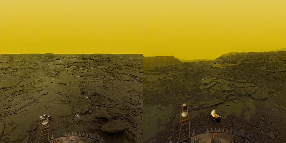
It looked a little more like this in its raw and unprocessed state:
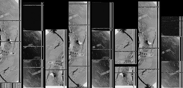
An in-depth technical explanation of the raw data Venera transmitted from Venus can be found here here
So what does this have to do with photography here on Earth, then? Part of NASA’s primary mission is “to reach for new heights and reveal the unknown so that what we do and learn will benefit all humankind” and it seems obvious enough that photographs play a big role in that mission. Or, more precisely, photographic data that are gathered from a immobile perspective, and then manipulated and massaged into a more recognizable form. Not in an effort to deceive, but as the mission statement says, to “reveal the unknown”. I think we’re doing the same thing when we make art. Of the many definitions out there, one of my favorite definitions of art is that it reveals the hidden aspects of the familiar. How else can we do that but though forced perspective, manipulation; by shifting the balance between foreign and familiar? These images from deep space manage to shrink the massive distances that separate us from the rest of the universe. To me, art functions in much the same way, only on a more recognizably human scale.