This would look better on Instagram
A few years ago, I started giving an assignment to my students; usually it’s the very first assignment of the semester. I send out a pdf of 10 photographs from a wide variety of sources. I provide no context; titles or supporting text is cropped or removed, and the students see nothing but the photograph. After a few basic remarks on formal terms like composition, lighting, focus, etc., I ask my students to look at these decontextualized images, and formulate a written response based on on what they see, where they might expect to find such an image, and whether they think it is even worth discussing in the first place. Ideally, they’ve never seen any of the photographs before. I also ask them to please not do a Google image search because providing the “right” answers is not the point. The point is, of course, to initiate the process of investigating and unpacking the internal logic of a photograph; I want to know what they see in the most literal sense of the word.
Art thrives on context, and good art sets up complicated relationships between context and content. Stripping out the peripheral information about a photograph and handing it to my students is partly an experiment on my part to see what sticks when all that’s left is the image. If I tell my students that I am showing them the work of an artist, they are already primed to see and respond to it in a particular way depending on what assumptions they carry about art — good or bad. Some of the images might look like they could be art but aren’t; I’ve used abstract NASA satellite imagery of the moon prior to the Apollo program, and more recently the Rosetta orbiter’s selfie from last year:
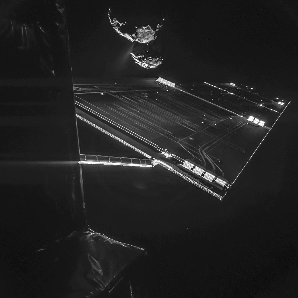
The image was taken on 7 October and captures the side of the Rosetta spacecraft and one of Rosetta’s 14 m-long solar wings, with the comet in the background. | Photo Credit : European Space Agency
I always look forward to hearing what my students have to say about the work from Corey Arcangel’s Photoshop Gradient Demonstrations:

Cory Arcangel, Photoshop CS: 84 by 66 inches, 300 DPI, RGB, square pixels, default gradient “Spectrum”, mousedown y=22100 x=14050, mouseup y=19700 x=1800, 2010, from the series Photoshop Gradient Demonstrations
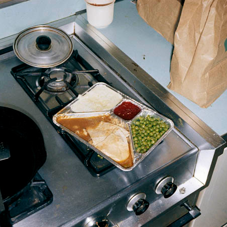
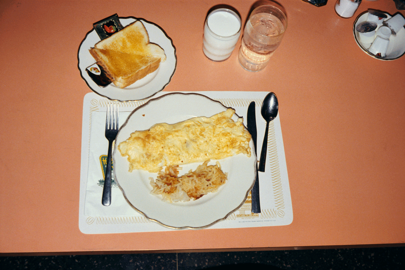
Usually the responses to this work range from, “I think this would be in a book about color theory,” to “This would probably be found in a hippy dorm room.” Fair enough. Which brings me to the picture at the top of the post, from Stephen Shore’s American Surfaces. It probably should come as no surprise that Stephen Shore is having a good time on Instagram. But the fact that he is, and the fact that the my students — who know nothing about his work— echo the obviousness of this connection is oddly striking. Here are a some of the responses this photograph has gotten over the past few years:
“This image of breakfast would probably be found on a social network.”
“This photograph looks like it would be found in someone’s phone.”
“Overall, I think it is a boring image.”
“Due to the poor quality, I’d probably find this image on social media.”
“I would expect to find this on Instagram, because it would look better if cropped to a square.”
This last one was especially good, because the student drew the square frame onto the printout that you see at the top of this post. And yes, some of these responses might seem funny on the surface, but I think they show with razor sharpness the weight that we give to the context of images when we decide to call them art. I’m not sure if it’s cliché to say that I learn from my students, but…I do. A lot. Especially when it comes to talking about art. Talking about art with artists or with experienced art students is easy; on some level, we all take the value of art for granted. But starting the conversation with just the image —with ONLY what you can see — is a valuable tool in reminding myself as a teacher and an artist that taking the value of things for granted is the cardinal sin of art making.
And by the way, if you were wondering, of course Stephen Shore take pictures of his food like anyone else. But there are only a couple, and this one of a mutton chop is his 3rd least-liked image (but please note the comments on it). Somehow, Stephen Shore’s food pictures on Instagram zipping past his followers without being liked seems a little weird considering this, this, and this to name a few. Don’t worry though, his photo of chicken fried steak did considerably better in the likes department. I tagged him in a shot of my students comment with the drawn-on crop marks and he liked it. That’s good enough for me.
I’ll leave you with this response to John Baldassari’s Wrong, which makes absolutely no sense to any of my students.
“This picture is not worth discussing because it is too simple.”
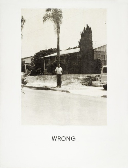
John Baldessari – Wrong 1967